American Public Media wanted to add more interactivity to the Marketplace show's website. I worked with their team to further the interactive experience and offer initial comps for visual design.
screen cap
In 2011 I was contacted by American Public Media’s Marketplace.org team to provide UX design for a new feature they were developing called “Marketplace Maps.” Marketplace.org wanted to offer a small selection of interactive microsites to engage their audiences beyond their broadcasts and podcasts, and this new “Marketplace Maps” was to fold nicely into the mix.
I worked with their web producer, developer and editor to create wireframes and initial comps. The user experience design centered around making the Marketplace Maps an engaging, interactive experience that took users beyond bland portlets of table data. The wireframes and comps needed to convey a fairly large amount of sortable data and yet had to be easy to navigate while also being visually appealing to a financial audience.
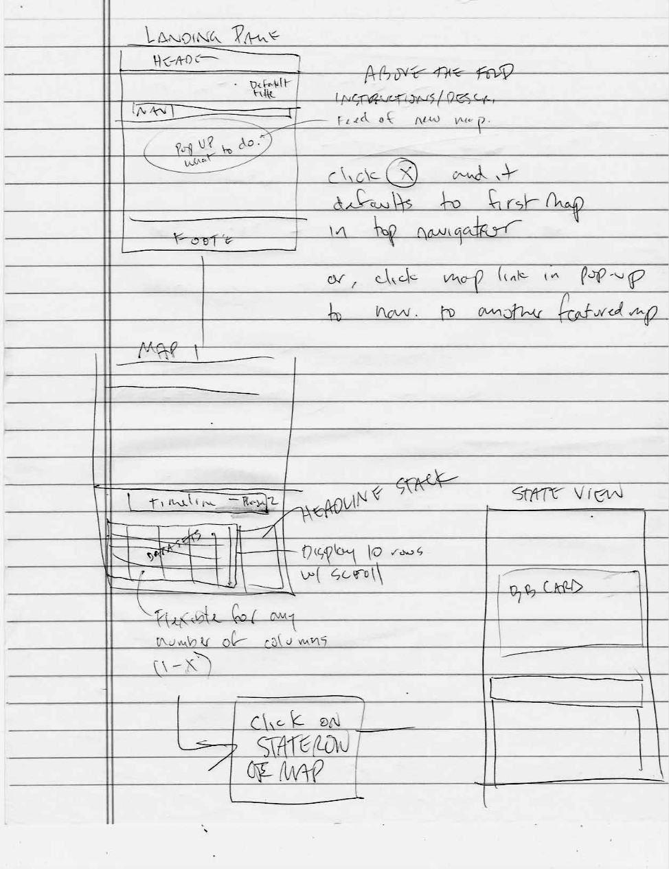
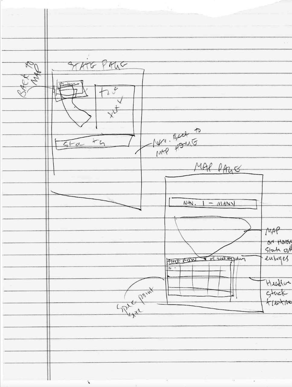
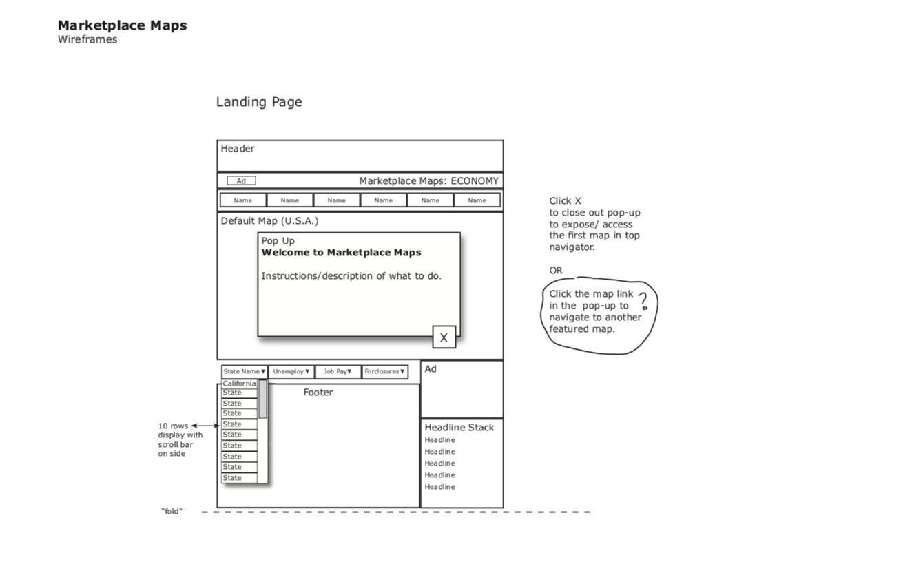
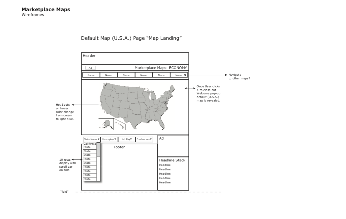
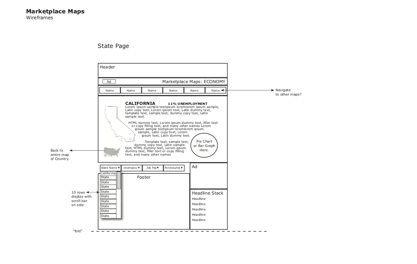
Initial mock for core map/data screens.