Corporate website refactor with a focus on a better user experience, bolder expression of brand throughout the site, and much more functionality.
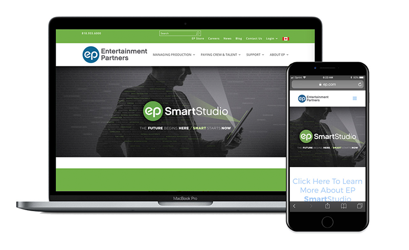
Entertainment Partners needed to modernize its company website ep.com and I was happy to lead the project by composing a plan, exploring new requirements, furthering the brand, improving the user experience, and having it made fully responsive.
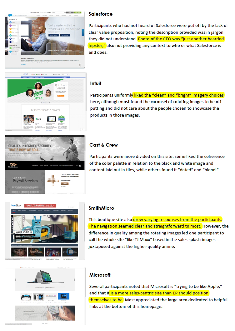
I wrote an initial plan then we (the UX team) began by interviewing company leadership for their current thoughts around brand, the message ep.com sought to communicate, and what they did/didn't like about the old site. We then interviewed a spectrum of ep.com users to understand the range of users (to render personas), their user needs with the site, and what their conception of a "tech" company site would be. We captured many of their ep.com objectives and then showed them some examples of related websites to gather their opinions as to what they felt a "tech" site resembles.
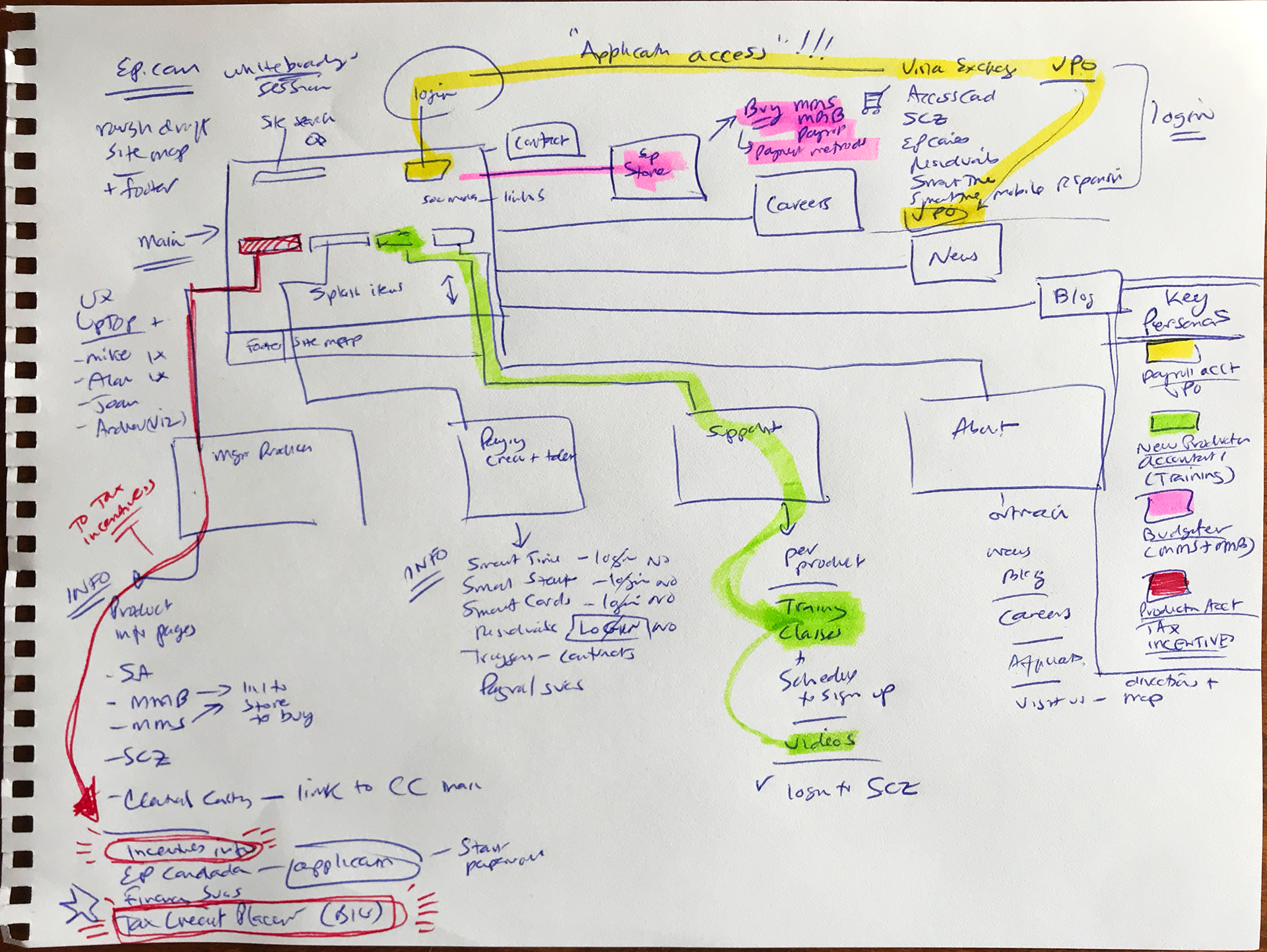
We composed a small set of personas identified from our earlier interviews. We then found participants representative of the personas to conduct a card sort to determine the information architecture (primarily to improve findability).
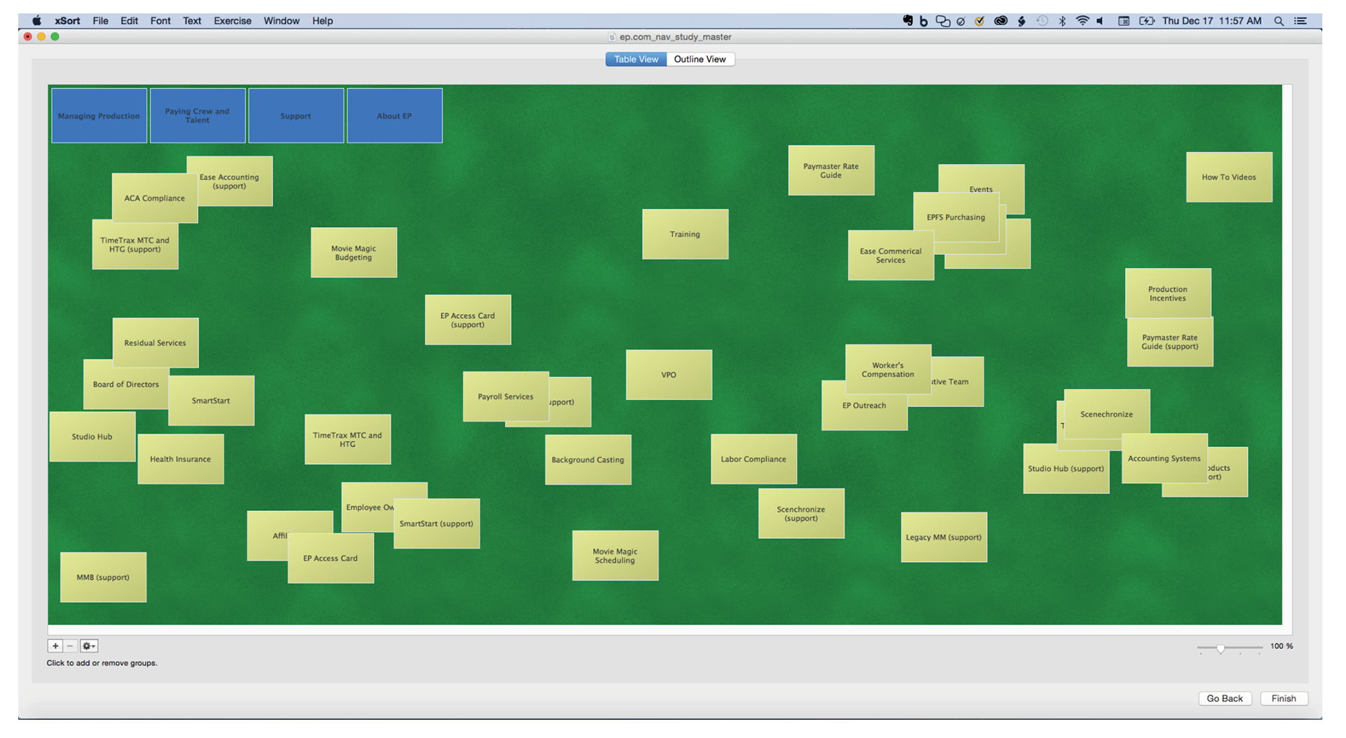
Results from the card sort informed the new navigation scheme.
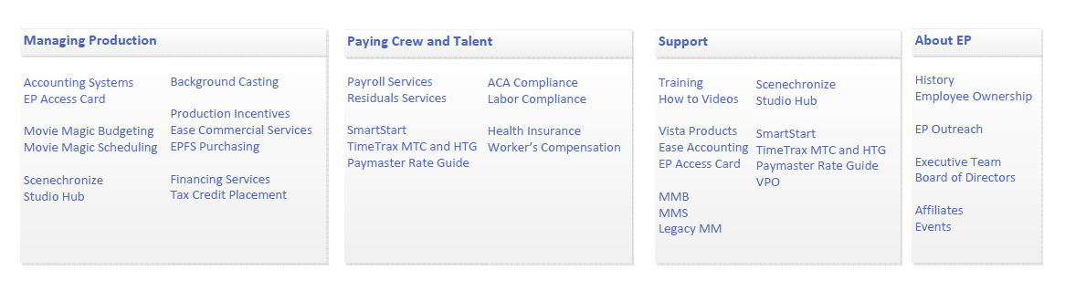
The new information architecture helped the team "whiteboard" a rough site map and highlight the paths for what research indicated as key personas for ep.com. We focused on further improving flows for three personas: a production accountant, a payroll accountant, and a unit production manager (UPM)/studio staff budgeter.
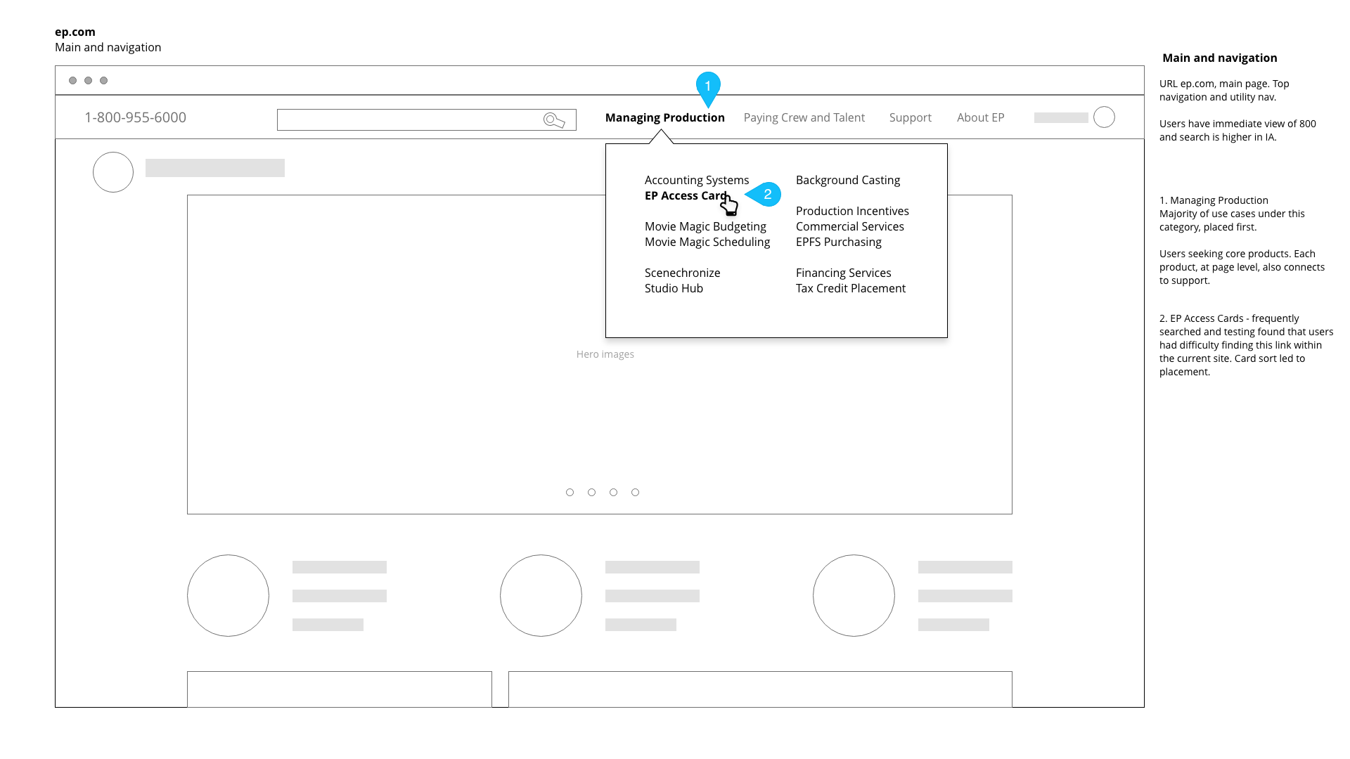
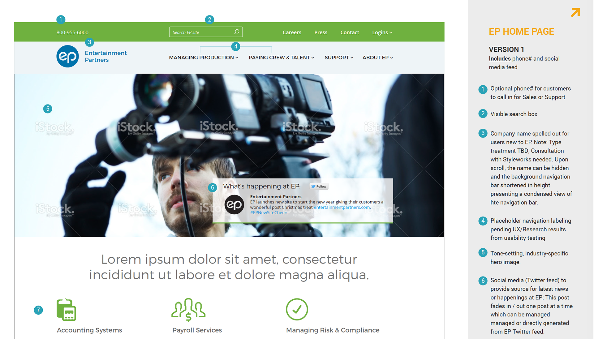
I wireframed key screens which were then shared with an outside agency, UpTop Creative, to further my initial designs to produce branded, higher fidelity mocks to test with users.
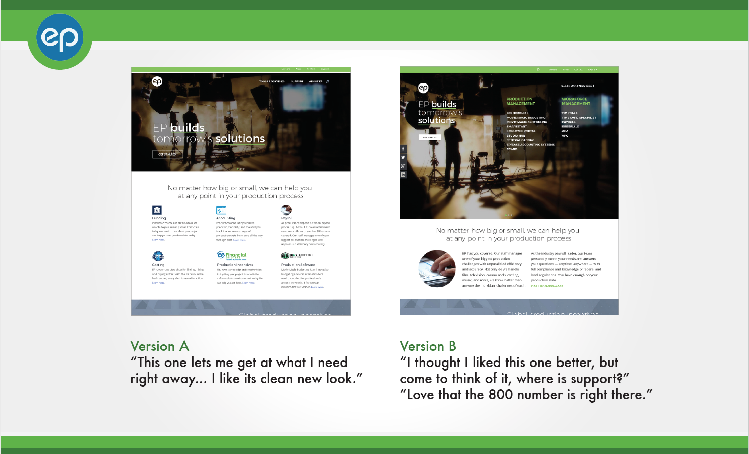
Some of the visual design mocks were then used as stimuli for A/B testing of certain treatments. Test study .pdf here.
We conducted a set of post-launch user tests focused on previously identified navigation issues: finding support for products and health insurance on the site. Eight participants out of eight tested were able to find support pages immediately for two products as well as the health insurance page. Additionally, before this redesign, support calls to find a file share aspect of the site (VPO) were high and the redesign saw a 45% reduction in calls related to users unable to find file share.
Entertainment Partners has just licensed an analytics tool called PENDO and, once installed, we will have better data to improve the user experience. We've recently completed our Pendo training and now product and UX are setting up analytics for key workflows.
The site is live and available here at ep.com.